Pseudo-Classes: What Are They And How To Use Them
Pseudo-Classes: What Are They and How to Use Them
Hey guys! Ever wondered how some CSS styles magically appear when you hover over a link or when you click on a button? That’s the work of pseudo-classes ! Let’s dive into what pseudo-classes are, how they work, and why they’re super useful in web development. Trust me, once you get the hang of these, your websites will look way more interactive and professional.
Table of Contents
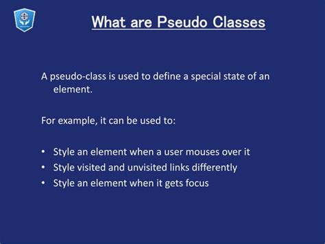
What Exactly Are Pseudo-Classes?
Pseudo-classes are like special keywords you add to CSS selectors to style an element based on its
state
or
position
in the document tree. Think of them as extra conditions you’re setting for your styles. For example, you can change the color of a link when someone hovers over it using the
:hover
pseudo-class. They allow you to apply styles when certain conditions are met, without needing JavaScript. This makes your code cleaner and more efficient.
Essentially, pseudo-classes target elements that can’t be targeted using normal CSS selectors alone. They’re denoted by a single colon (
:
) followed by the name of the pseudo-class. Some common examples include
:hover
,
:active
,
:focus
, and
:visited
. Each of these does something different, and knowing how to use them can seriously level up your CSS game.
Pseudo-classes are incredibly versatile. You can use them to create interactive menus, highlight form fields, style visited links, and much more. They’re an essential tool in creating dynamic and user-friendly web interfaces. By understanding and utilizing pseudo-classes effectively, you can enhance the user experience and make your websites more engaging. Plus, they’re supported by all major browsers, so you don’t have to worry about compatibility issues. Whether you’re a beginner or an experienced developer, mastering pseudo-classes is a must for any CSS enthusiast. So, let’s jump in and explore some of the most commonly used pseudo-classes and how you can incorporate them into your projects.
Commonly Used Pseudo-Classes
Alright, let’s get into the nitty-gritty of some of the most commonly used pseudo-classes. Knowing these will give you a solid foundation for creating awesome effects on your web pages.
:hover
The
:hover
pseudo-class is probably the most well-known and frequently used. It applies styles when the user hovers their mouse over an element. This is perfect for creating interactive buttons, links, and other elements that react to user interaction. For instance, you can change the background color of a button or enlarge an image on hover to give users a visual cue that the element is interactive. The
:hover
pseudo-class enhances usability by providing feedback to the user, making the interface more intuitive.
Using
:hover
is straightforward. Simply add it to your CSS selector like this:
a:hover {
 color: red;
}
This code changes the color of a link to red when the user hovers over it. You can apply any CSS property within the
:hover
block to create various effects. It’s a simple yet powerful way to make your website more engaging and responsive. Make sure to use it judiciously to avoid overwhelming the user with too many changes.
:active
The
:active
pseudo-class applies styles when an element is being activated, such as when a button is clicked. It’s useful for providing visual feedback to the user that their action has been registered. For example, you can slightly change the background color or add a subtle animation to a button when it’s clicked. This makes the interaction feel more responsive and satisfying. The
:active
state is typically very brief, so the changes should be noticeable but not distracting.
Here’s how you can use the
:active
pseudo-class:
button:active {
 background-color: darkblue;
}
This code changes the background color of a button to dark blue when it’s clicked. You can combine
:active
with other pseudo-classes like
:hover
to create more complex interactions. Just remember that the
:active
state is momentary, so the effect should be quick and clear.
:focus
The
:focus
pseudo-class applies styles when an element has focus, typically when a user selects it using the keyboard or clicks on an input field. This is particularly important for accessibility, as it helps users who rely on keyboard navigation to understand which element is currently selected. By default, browsers often provide a default focus outline, but you can customize this using the
:focus
pseudo-class to better match your website’s design. A well-designed focus state improves usability and ensures that your site is accessible to all users.
Here’s an example of how to use the
:focus
pseudo-class:
input:focus {
 border: 2px solid green;
}
This code adds a green border to an input field when it’s focused. You can also use
:focus
to highlight other interactive elements like links and buttons. Just make sure the focus state is clearly visible and distinguishable from the normal state.
:visited
The
:visited
pseudo-class applies styles to links that the user has already visited. This can be useful for helping users keep track of where they’ve been on your site. By default, browsers often style visited links differently, but you can customize this using the
:visited
pseudo-class to better fit your website’s design. However, there are some restrictions on which CSS properties you can use with
:visited
for security reasons. You can typically change the color, background color, border color, and outline color.
Here’s how you can use the
:visited
pseudo-class:
a:visited {
 color: purple;
}
This code changes the color of visited links to purple. Using
:visited
can improve the user experience by providing a visual cue for previously visited pages, making navigation easier and more intuitive.
More Advanced Pseudo-Classes
Okay, now that we’ve covered the basics, let’s dive into some more advanced and powerful pseudo-classes that can take your CSS skills to the next level!
:first-child and :last-child
The
:first-child
and
:last-child
pseudo-classes are used to target the first and last elements within a parent element, respectively. These are incredibly useful for styling lists, navigation menus, and other structured content. For example, you can use
:first-child
to remove the top border from the first item in a list or
:last-child
to add a special style to the last item in a menu.
Here’s how you can use them:
li:first-child {
 font-weight: bold;
}

li:last-child {
 border-bottom: none;
}
This code makes the first list item bold and removes the bottom border from the last list item. These pseudo-classes can help you create cleaner and more visually appealing layouts by applying specific styles to the beginning and end of a series of elements.
:nth-child()
The
:nth-child()
pseudo-class is a real game-changer. It allows you to target elements based on their position within a parent element, but with much more flexibility than
:first-child
and
:last-child
. You can use it to style every even or odd element, or even target specific elements based on a formula. This is perfect for creating striped tables, alternating background colors, and other complex patterns.
Here are a few examples:
/* Style every even list item */
li:nth-child(even) {
 background-color: #f2f2f2;
}

/* Style every odd list item */
li:nth-child(odd) {
 background-color: #ffffff;
}

/* Style the third list item */
li:nth-child(3) {
 font-style: italic;
}
The
:nth-child()
pseudo-class can take different arguments, such as
even
,
odd
, or a specific number. You can also use a formula like
2n
(every even element),
2n+1
(every odd element), or
3n
(every third element). This gives you a ton of control over how your content is styled.
:not()
The
:not()
pseudo-class is used to target elements that do
not
match a specific selector. This can be incredibly useful for applying styles to all elements except for a few specific ones. For example, you can style all buttons except for the primary button, or style all links except for those within a navigation menu.
Here’s how you can use it:
/* Style all buttons except the primary button */
button:not(.primary) {
 background-color: gray;
 color: white;
}
This code styles all buttons with a gray background and white text, except for those with the class
primary
. The
:not()
pseudo-class can help you write more concise and maintainable CSS by avoiding the need to write separate rules for each element you want to style differently.
Practical Examples of Using Pseudo-Classes
Alright, let’s get practical and look at some real-world examples of how you can use pseudo-classes to enhance your web designs.
Interactive Navigation Menu
Navigation menus are a crucial part of any website, and pseudo-classes can help you make them more interactive and user-friendly. You can use
:hover
to highlight menu items when the user hovers over them,
:active
to indicate the currently selected item, and
:visited
to show which pages the user has already visited.
Here’s an example:
<nav>
 <ul>
 <li><a href="#">Home</a></li>
 <li><a href="#">About</a></li>
 <li><a href="#">Services</a></li>
 <li><a href="#">Contact</a></li>
 </ul>
</nav>
nav ul li a {
 display: block;
 padding: 10px 20px;
 text-decoration: none;
 color: #333;
}

nav ul li a:hover {
 background-color: #f2f2f2;
}

nav ul li a:active {
 background-color: #ddd;
}

nav ul li a:visited {
 color: #888;
}
This code creates a simple navigation menu with hover, active, and visited states. The
:hover
effect changes the background color when the user hovers over a menu item, the
:active
effect provides feedback when a menu item is clicked, and the
:visited
effect changes the color of visited links.
Styled Form Fields
Forms are another area where pseudo-classes can make a big difference. You can use
:focus
to highlight input fields when they are selected,
:valid
and
:invalid
to provide feedback on the validity of the input, and
:required
to indicate which fields are required.
Here’s an example:
<form>
 <label for="name">Name:</label>
 <input type="text" id="name" name="name" required>
 <label for="email">Email:</label>
 <input type="email" id="email" name="email" required>
 <button type="submit">Submit</button>
</form>
input:focus {
 border: 2px solid blue;
}

input:valid {
 border: 2px solid green;
}

input:invalid {
 border: 2px solid red;
}

input:required {
 background-color: #ffefef;
}
This code styles the input fields with a blue border when they are focused, a green border when they are valid, a red border when they are invalid, and a light red background when they are required. These visual cues help users fill out the form correctly and improve the overall user experience.
Animated Buttons
Pseudo-classes can also be used to create animated buttons that provide visual feedback when the user interacts with them. You can use
:hover
and
:active
to trigger animations, such as scaling, fading, or sliding effects.
Here’s an example:
<button>Click me</button>
button {
 background-color: #4CAF50;
 border: none;
 color: white;
 padding: 15px 32px;
 text-align: center;
 text-decoration: none;
 display: inline-block;
 font-size: 16px;
 transition: transform 0.2s;
}

button:hover {
 transform: scale(1.1);
}

button:active {
 transform: scale(0.9);
}
This code creates a button that scales up slightly when the user hovers over it and scales down slightly when the user clicks it. The
transition
property is used to create a smooth animation effect. These subtle animations make the button feel more interactive and responsive.
Conclusion
So there you have it, guys! Pseudo-classes are an incredibly powerful tool in CSS that can help you create more interactive, user-friendly, and visually appealing websites. From simple hover effects to complex animations, pseudo-classes offer a wide range of possibilities for enhancing the user experience. By mastering these techniques, you can take your CSS skills to the next level and create websites that stand out from the crowd. So go ahead, experiment with different pseudo-classes, and see what amazing things you can create! Keep coding, and have fun!
